
Nowadays, Responsive design (Responsive Web Design) is not just a matter of fashion. It is about enabling access to the content of web pages, no matter on which device (mobile, tablet, desktop pc, ...) you open the selected page. With the massive boom of mobile devices such as tablets and smart phones, the question arises how to project the content of the webpage for the users of these devices so that it is readable and to minimize the need to zoom in and scroll the screen. Already in 2010 the sale of smart phones and tablets outnumbered the worldwide sales of PCs and laptop, and now the ratio is even increasing. It follows, therefore, that more and more people are visiting websites via smartphones or tablets and site owners should not forget that sites that up to 99% sites not directly designed for mobile devices will be untransparent and the trader and publisher can lose a lot of visitors, or even a large percentage of sales.
What is responsive design?
Simple definition: Responsive design is actually customize the content of a website to the size of a mobile device. A standard website is optimized for ordinary PCs or laptops. However, if a visitor opens a web or eshop in a tablet or smart phone and the pages are not optimized using responsive design, the conditions for surfing are not ideal. The entire page, as we know it from the PC, shrinks to the format of the screen resolution of the device and it works the usual way. This is not the most ideal solution. Imagine that a page with a resolution of 1024x768 meant for 17-inch monitors suddenly shrinks to a resolution of 480 x 320 on a 3-inch display. That's more than 11-fold reduction of the site and all elements (text, buttons, images, links) are small, unreadable and in its original design they are conceived primarily for desktop PCs using mice, not for human fingers. The visitor is forced to enlarge everything in a complicated way, move with the fingers, which are broader than pointer and one can not always correctly denote what he wants. Responsive design is here to account all the ergonomic requirements of mobile devices. Because of limited space, it is appropriate to incorporate, select and correctly arrange the elements that really matter. There is no change in the page itself, it remains as it was, but a few lines will be added to your finished pages for external files, which define how to set and display the resolution.
Bootstrap Templates, What are They and Why You Need One?
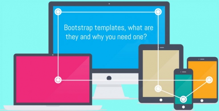
If you are looking for a highly responsive, easily customizable and beautifully designed web template you need one built with Bootstrap. What is so special about Bootstrap and why should you care what your template is built with? Well, let's find out, shall we?
If you have already realized the value of having a mobile Web site or of having your existing Web site optimized for mobile viewing, then you would have heard of both responsive Web design and HTML5.
It's becoming increasingly important for web designers and developers to adapt to responsive design, which works around the principle of sites adapting to different devices when users load them.
News & Announcement

Apr 01 2012

Feb 20 2012
 E-mail:sales@arisity.com
 Location: 1107 Fair Oaks Avenue STE 330,South Pasadena,CA 91030


